"KEEP BUSTIN'."

new look

Just in time for my 13ish year on the “internet” I have decided it’s time for a new look. This is mainly because as I get older my eyes are having a hard time reading the red/grey on black, and partly because a couple years ago a friend of Drew McWeeny wrote and told me he had a seizure while reading one of my reviews. I don’t want to be responsible for any major medical events. Also, I’m trying to be more professional as Christian Bale once suggested was a good thing to do and he is a good actor.

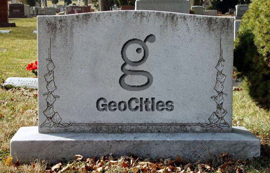
Please thank Clubside Chris for all his work creating this look based on my pain in the ass suggestions, plus the previous fake Geocities look, which will be available in the dropdown menu at the lower right for those who want to stick with it (it might need some fixing but will be operable soon).

Anyway, I hope people and eyeballs enjoy it. We will be trying out some new features too. Suggestions welcome but don’t be an ass.

thanks for reading, everybody

This entry was posted on Tuesday, August 7th, 2012 at 3:02 pm and is filed under Blog Post (short for weblog), Site News. You can follow any responses to this entry through the RSS 2.0 feed. You can skip to the end and leave a response. Pinging is currently not allowed.

55 Responses to “new look”

  1. looks great vern! thanks

  2. In my opinion it looks a little bit too much like, well…a WordPress blog. A little bit too clean, maybe. But it’s not a bad look. I don’t think that I will change it back to the old style.

  3. holy god all i did was reload to see if there were new comments, i broke vern’s site, fuck

  4. As long as April Fool’s Day 2008 doesn’t become a reality, Vern, you’ll always be solid in my book.

  5. I’m relatively new here, but I’m loving this :)

  6. I think it looks good. Thanks.

  7. Digging the new look. Pretty cool to think how this site has evolved over the years.

  8. I played around with the settings and now I can’t change them back. This sucks.

  9. eh, I actually LIKED the black look of your website Vern, for me personally that’s easier on the eyes

    but I’ll give this one a chance though, but may I ask, how come you didn’t take this opportunity to make our gravatars bigger?

  10. I do like though how you made the background of your reviews look like paper instead of just stark white

  11. Looks great, Vern. I’ve never stopped reading. This will only make my daily visits all the more enjoyable.

  12. This feels weird. I was so used to the old look it was like a grungy trademark that symbolized the underground beginnings of this site. Now it’s looking more similar to other review sites like it’s now all grown up. I guess I could get used to the more positive vibes that a lighter layout brings but I won’t front and say that I won’t miss the “classic” look. It had lots of character.

  13. This website has been very influential on me as a filmwatcher, and just a general human being, and I stop by here every now and again. I can safely say this website has NEVER looked better.

  14. All you comic bookers might be interested to know that I based the new header on a magazine called Deadly Hands of Kung Fu, put out by Marvel Comics in the ’70s. The blurb on the right comes from a black film magazine called Reel Soul, which is why the text makes no sense here, but it’s a work in progress. I wanted the background to look like a slightly yellowed paperback.

    Thanks for the nice comments or for being willing to give it a try. I have always loved the shitty Geocities look, but have never enjoyed eye strain. I resisted this for a long time but I do want to grow the readership here eventually so we’ll see if it helps to not immediately turn people away.

  15. For those looking for a more “pulp magazine” look I’m experimenting with some fonts, take a look at the All Tags page (which now actually shows all tags, before it was limited to 1000). I think I may have even found the perfect ’40s detective font that might be great for headlines.

    How big were you looking for the Gravatars to be Griff? They’re already larger than most sites. I’m hoping to integrate Facebook comments and Twitter replies into the comments section with a great plugin called Social by MailChimp, but the fucker is heavily styled and uses tiny Gravatars so I’m still trying to make it work.

    There’s a lot of behind-the-scenes WordPress development going on, hoping to try some new features. As Vern said, suggestions are always welcome, it’s his site I just try to implement what’s described. If you have ideas that are tough to put into words pull together some example graphics!

  16. Vern, as long as you keep writing that quality shit, then I’ll keep coming to this site. Looks good, man.

    The only thing I might change, since you’re thinking about the new readers, is to maybe take the “Shit I Have Here” list and slap that up top on your new banner, right in that little black void under “On The Films Of Cinema.”

  17. Quality of the writing is what keeps us coming back, but the new look is fine. Might take a bit of getting used to, but we say that every time it evolves. Keep up the good work.

  18. That would be way too big, Griff. Don’t use your gravatar as a gravacrutch.

  19. Well, this is fuckin’ weird, kind of like looking at a Platinum Dunes remake of Vern’s territory, which means it also looks really good and professional. I like it, but it’s gonna take some getting used to.

  20. Now we got a Parker quote on the top-right header. Nice. Is there any rhyme or reason to them? You got a big bag that the computer just snatches up at random?

  21. I never had eye strain, But this looks good.

  22. Rehydrated Dehydrated Pirate Paul

    August 8th, 2012 at 4:03 am

    AAAAAAARGH!!! MY EYES!!! IT’S TOO BRIGHT!!!!!!!!

    Nah, just kiddin’, looks fine to me. :) Like someone said, as long as you keep cranking out the reviews, Vern, I’ll read / post on your site in psychadelic purple and lime if need be.

  23. Rehydrated Dehydrated Pirate Paul

    August 8th, 2012 at 4:08 am

    Although come to think of it, please don’t take that last sentence as a valid and workable suggestion.

  24. What is important is that my Vern makes his site look like how I think it should look. LOL it is about the content, not the background. Do whatever the fuck you want with it Verm.

  25. Jareth Cutestory

    August 8th, 2012 at 7:16 am

    C’mon, Griff, your crazed, bloody Helen Hunt will take over the whole internet!

    Also, this new format looks so sedate. I can read these reviews at work and no one will suspect that I’m on a horsefucker web site.

  26. Well,shit. I accidentally changed the layout to the one with the white background and now I have no idea to change back to the new one. Help,please…?

  27. Jareth Cutestory

    August 8th, 2012 at 8:07 am

    That’s what I did too. It’s like Sliders travelling through multiple Verniverses.
    Or maybe it’s like Quantum Leap. Bad news! Ziggy says you can’t go home until you convince Asimov that STAR TREK isn’t an abomination.

  28. I got stuck on the white page for a minute, too, but I just went back a page and everything worked out.

  29. I tried that, didn´t work and now I am stuck in what looks like internet limbo…

  30. Aaaaaaahhhhh!!! I DON’T LIKE CHANGE!!!

  31. You can manually switch the themes (for now) with these URLs:

    https://outlawvern.com/?wptheme=vern2012

    Will get you to the new one, to go old school

    https://outlawvern.com/?wptheme=vern

    There’s a new version of old school coming as Vern mentioned with a toggle gadget at the top. When I have it fInished you won’t have to worry about getting stuck as it will be an alternate style sheet rather than theme.

  32. Vern, I am behind the redesign 100%. Although I grew accustomed to the old color scheme and it was a warm reminder of 13 or so years of checking your site almost every single day it was hell on my poor eyes and I could not get the theme switcher to work properly on my outdated eMac. One question, though – how does that cokehead Walter Leno feel about all of this?

  33. Holy shit, you guys. Somebody is trying to make a documentary about Dick Miller and they need your help to do it.

    http://www.kickstarter.com/projects/809530602/that-guy-dick-miller

    As Dick Miller is probably my favorite character actor, beating out even Brad Dourif, I went with the $30 Mr. Futterman option, which comes with my name in
    the credits, a DVD of American Grindhouse, and a Dick Miller button and T-shirt.

    I love Dick so much, I’ll pay good money to have Dick all over my body.

  34. I love it, particularly the very prominent “Then fuck you, Jack.” The Parker quote sets the mood perfectly.

  35. Majestyk – Thanks for the Dick Miller Kickstarter link, I’m all over that. I would kill for the PIRANHA pressbook signed by Joe Dante and Dick Miller, but some bastard beat me to it.

    Vern – a random Parker/Various Badass quote of the day would be awesome!

  36. What does it take to change the essence of a websight? I need time to get used to it

  37. Zeke: I’m not much of a memorabilia guy myself. I prefer stuff I can use. So the DVD and the T-shirt (plus knowing I helped get the movie made) is enough for me.

  38. I like it. It matches the colors in my living room. /girly

    Seriously, though, my eyes thank you.

    (And it actually does match the color scheme of my living room.)

  39. Love the new look more then the last one. This has the look of old pulp comics just the way your site should look.

  40. Of course now I look back at the comments and realize that the look is actually based on old pulp comics,lol You achieved exactly what you set out to do. Great job Vern!

  41. The Geocities tombstone on the bottom of the site made me laugh. I think I never laughed harder at a grave.

  42. Okay, so I’m one of those “first-time commenter, long-time reader” types. Apologies. But I figured that the new look should come with a new attitude on my part — y’know, getting involved and that sort of thing.

    Anyway, as for the new look, I think it’s great. But as the web nerds say, “content is king” — and this place has content to crack skulls for. I know I’d keep on reading whatever it looked like.

    But while things are a-changing, can I second the call for a revolving selection of badass quotations at the top of the page? After all, it’s often the words — blunt and sparse — as much as the moves that make someone badass. The badass arts demand their own dictionary of quotations, dammit.

    And can I also say ‘thanks’ to Vern and the regulars around here? I’ve learnt a lot from you guys over the past few years of lurking in the background. Hopefully I’ll be able to give a little back, etc, etc.

  43. Thanks Pete. Always good to have new commenters. Yeah, I’m gonna change the quote up there periodically, but I have to do it manually so it will be when inspiration hits and not just a random changing type thing.

    thanks

  44. I’m sure Vern will post an announcement but we’ve got a new feature to try out: Q&A. There’s really no Quora for film so why not have it here? You’ll find new links in the new menu bar (which I’m still working on, archive fans) and some starter questions. I need to add categories and of course we need to find out if this sort of thing will engage readers so take a look when you get the chance.

  45. Hey clubside, thanks for those links! I thought I was going to be stuck with the bright white background forever! I think I’ll try out the new look for a while. I’m not sure yet if I like it. I always loved the black background with lighter text. I find it much easier on the eyes. But this new look seems pretty good as far as eye strain, so maybe I’ll grow to love it.

  46. Okay, it’s not done, but so close I need people to make sure that vern2012 is their selected theme if it is currently something else. I’ll be removing the theme switcher Sunday, so I don’t know what will happen to anyone not set to the current theme at that point.

    The replacement? You see three choices above the Theme Switcher under Alternate Styles. You can use those links, but the real interface is now in the header. Notice the three small colored blocks in the lower right hand corner? Each has a tooltip, but the first represents Vern’s new design, the second an approximation of the old site design, or “classic”, and the third is an experimental area for me to test things because dealing with overlapping stylesheets is no fun lol.

    By going this route I’ll be able to re-introduce the page cache which will speed up the site tremendously. Previously I had to turn it off because each theme was a wholly different page layout which means it couldn’t cache. Or it could, but only one theme which meant different users with different theme selections could force one page into one theme while another forced a different choice. It’s even more complicated than that, but the bottom line is that with this new method you’ll get instantaneous style changes (go ahead a try it) which the site will still remember but with faster page loading.

    I know the classic style isn’t completely done, that’s the reason for experimental so I can test how the same style in different stylesheets is affected by the cascade, but I hope to have it completely ready by late Friday night. That’s the reason I need anyone not set to vern2012 to switch now, so their settings are correct when the Theme Switcher is removed.

    Sorry for all the geek speak, can’t help myself. I have no one to babble such nonsense to. *sob*

  47. Hey Griff, I bumped the Gravatars up to 96px, it’s not 200 but hopefully a little better for ya? lol

    I also changed the comment box to show a Gravatar no matter your situation: if you’re not logged in and haven’t typed in an email address you just get a generic Gravatar logo; not logged in and don’t already have a Gravatar, a sign-up link on top of the generic Gravatar; logged in or with a valid Gravatar email address, you see the Gravatar that will appear with your comment.

  48. Jareth Cutestory

    August 13th, 2012 at 7:41 am

    Hey Chris,

    On my computer, this new format overlaps the boxes on the right hand side of the page (Don’t be Ellis etc) onto the main section (the actual reviews) in a way that obsucres about 10% of the text. This happens regardless of the theme that I use (classic, 2012 et cetera). Do you know how to fix this? Thanks.

  49. Hey Jareth, there should be no theme switcher any more, only the style switcher. If you’re still seeing a theme switcher I’d recommend just doing a refresh on the home page and see what happens. If you still have an issue let me know what browser and version you’re using and your screen resolution and I’ll try to simulate it. So far I’ve tested IE9, Chrome, Firefox and the iPad to ensure all is well. Once everything is tidied up I’m going to convert to a responsive layout so phones and tablets get more width, moving the sidebar stuff above and below the content.

  50. Thanks Chris. I’m using Microsoft XP 2002 but the Internet Explorer seems to be configured for Windows 95 on this particular computer. At home, where I use a computer that wasn’t built during the Clinton Administration, I don’t have this problem. I have no idea how to figure out screen resolution (does Intel(R) Q45/Q43 Express Chipset mean anything?). I access the various versions of the site in the Meta catagory on the side menu. I might have mischaracterized that as a “theme” when it is really a “style.”

    I’d understand if you had more important things to do than to chase after the specs for every obsolete system. I certainly don’t mind cutting and pasting the obscurred content into a word document in order to read it. Most web sites that I access have evolved to the kind of presentation that make them impossible to read using this system. At least with this site I get the gist of it.

    Thanks!

  51. I haven’t had the time to check IE7 or IE8 but the column structure I’m using should work in any browser IE6+ and Netscape 4+ if you want to talk old. There are certainly aspects to the layout that wouldn’t look right but there shouldn’t be any overlap. Let me fire up a virtual machine and check older IE… okay, just booted XP SP3 with IE8 and there are no problems. To test IE7 I’ll need my Windows Vista setup, lemme find that one… that works fine, too, which leads me to the dreaded IE6 a browser that no one supports anymore… My Windows 2000 box reveals… that must be what you’re using, looks just as you described. Sorry dude, IE6 is more than a decade old, supporting it would mean 99.999999% would suffer. Are you allowed to install programs? Both Firefox and Chrome will work fine and show the site better than any version of IE, and if you’re stuck with IE6 to run intranet apps you just use IE for those, another browser for surfing. When I’m converting to a responsive layout I may look at how easy it would be to add an IE6 hack to make things work, but basically if your design doesn’t use tables, IE6 will break it. I mean look at the upper right hand corner, that explosion box should transparently overlay the white bar, but IE6 doesn’t even support .PNG files without a hack.

  52. I appreciate the time you took to investigate the problem, Chris. Please don’t compromise the site for the sake of this lousy system I’m using; it’s still largely legible.

  53. Thank you SO MUCH for switching over. I pretty much had to stop reading because of the color scheme. There was the other “WordPress Classic” setup but I could never get it to stick on my computer.

Leave a Reply


XHTML: You can use: <a href="" title=""> <abbr title=""> <acronym title=""> <b> <blockquote cite=""> <cite> <code> <del datetime=""> <em> <i> <q cite=""> <s> <strike> <strong>